In defence of mood


A designer from the Netherlands once gave a talk at our studio over lunch. Jeroen made beautiful objects in a past life as an industrial designer, but after encountering experience and service design, he gave up industrial design and ended up travelling the world, investigating how to apply user-centred design and social entrepreneurship to address poverty. I’m not particularly sympathetic to the idea that entrepreneurialism can solve structural economic inequality, but I welcomed Jeroen’s candour about the lessons he learned on his journey.
What did puzzle me, though, was his attitude to methods that predate our stereotypical user-centred design world of Post-it notes, lo-fi prototypes and co-design workshops. Bemoaning the state of design education, he declared with disgust that “in Amsterdam, there are students who still think you can design with mood boards!”
Okay. When did mood boards become beyond the pale? When did a fetish for sticky notes succeed in displacing aesthetics? This feels like user-centred design puritanism. And as the design director of a user-centred design studio, I find that mood boards are not only useful, but that mood itself is a key element that needs defending in the design process.
From method to heuristics to method
We didn’t always explicitly use user-centred design methods at our studio. Originally cast in a more classic visual communications mould, we art-directed material for progressive causes. We found that this wasn’t enough; lately, everyone’s understanding of media has shifted from a transmission-oriented model of communication to one that’s concerned with how complex ecosystems interact, which demands new conceptual tools and methods. But these new tools and methods were also very much in tune with our own take on our work: user-centred design fit our commitment to doing justice to the issues we cared about.
Suffice to say that our embrace of user-centred design a decade ago (yes, before it was cool, haha) was both a sea change and a kind of continuity. While our new media universe does bring certain issues into relief, thinking about stakeholders and their situations is not terribly new: just as bespoke tailors have always known how to ask their clients where and when they’ll be wearing certain garments before they’re made, graphic designers have always taken context into account. Across the existence of our discipline, this understanding of context slowly crystallised into the heursitic conventions of print design: this is how tables of contents work; that is best practice in typographic content hieararchy, etc.
Montage and argument
It’s true that many kinds of graphic design wisdom have ossified, and or been taken as gospel rather than seen as the outcomes of real processes of understanding. But at their best, graphic design methods might surprise UCD practitioners.
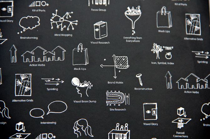
In my design practice, mood boards aren’t a superficial or arbitrary grab bag of visuals that happen to appeal to me. If you’re doing that, you’re simply being a lazy designer. Neither are they necessarily the best visual matches for how I think my designs will ultimately turn out, as an early replacement for mockups. This limits your possibilities, and renders your process too literal.
Rather, moodboards are a way of assembling material in a montage to make an aesthetico-conceptual argument. How should things feel for our users, and why? What references allow us to think through a range feelings, from the intention behind one’s graphical choices, to actual examples thereof?
For example, if I’m designing a system that empowers people to more easily increase their apartment blocks’ energy efficiency, I might assemble a bunch of references: the playfully urban, graph-like geometry of Blue Note jazz album covers and Saul Bass graphics; DIY hardware manuals; and the stationery-fetishism of the “productivity hack” subculture.
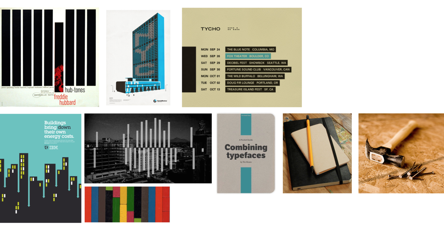
The argument: when we get together to reduce our collective carbon footprint, we can see it as our improvisatory but ever-improving action around the rhythms of self-measurement, which is rewardingly practical and efficient. We can become our own productivity porn. This is what my mood board argues about what the experience of the entire project might be, and it also supplies a blend of aesthetics that we can put into action in the project’s actual art direction.
Through montage, mood boards are good at synthesising new combinations of meaning in suggestive ways. Other things — affinity mapping the outputs of contextual inquiries, creating personas, storyboarding archetypal use cases and mapping user flows — are good at finding and modelling users’ needs and behaviours, seeing the opportunities within those, and then bringing them to life in ways that can be prodded, tested and revised. Each has advantages and limitations.
The pervasiveness of mood
But mood isn’t just the domain of visual design. Now that we’re in an era of complex media ecologies rather than the centralised messages of broadcast models of communication, the way we shape the spaces in which we make meanings with each other has become paramount. Rather than shaping and colouring “the message”, we’re more invested as designers in making spaces that are conducive to various things happening.
Our speciality as a studio is designing to enable positive social and environmental change, and I’ve always felt that a good way to approach this is allowing people to get on the same wavelength in a mutual negotiation, rather than an evangelical model, in which we convert people to a cause. It’s a way to create resonance, rather than converts. It’s a way to make spaces that vibrate in the right way. For us, creating great experience architecture is a way to make spaces for people to get in tune with each other.
This isn’t something anyone should take lightly. As Wilson Miner put it in his justifiably influential talk at Build 2011, shaping the digital spaces in which people are going to spend a majority of their time is a great responsibility:
(See the whole thing here.)
For me, the key word here is “feel”: “What do we want that environment to feellike?” Miner asks. “What do we want to feel like?”
Isn’t this one of the most important design questions of our time? And I think mood boards, amongst other things, continue to be very relevant to this.
In our world of "don't make me think"-style usability, sometimes people like to pretend that everything can be reduced to arranging elements of information in the most logical and seamless manner so that everything we do as designers becomes invisible. That’s simply bullshit. I fart in your general direction, colourless usability rationalists. Sure, not all systems or places should be in your face, but all spaces should have a mood.
So as I continue to do user-centred design for social change, there’s a great coda for me that ties most of this together. Let’s return to resonance and getting in tune as a model for communicating change in the spaces we create. The philosopher Martin Heidegger had a really interesting take on mood; he used the German word “Stimmung” to talk about it. For Heidegger, mood was not simply something we experience internally, but something that happens between people, and attached to certain spaces. It's great, then, that “Stimmung” also means "attunement" in German. Mood and attunement. Two sides of the same coin.
This is why I defend the use of mood boards.